CSS基础
CSS样式
- 内联样式(元素的style属性中)
- 内部样式表(HTML的style元素中)
- 外部样式表(.css文件中,通过link元素导入)
文本
text-decoration:none(无装饰线)、underline(下划线)、overline(上划线)、through(中划线/删除线)
text-transform:capitaliza(每个单词首字母大写)、uppercase(每个单词字符变为大写)、lowercase(每个单词字符变小写)、none(没有影响)
text-indent:(em/px)第一行内容的缩进——em是当前文字的大小,2em就是两个文字
text-align:left(左对齐)、right(右对齐)、center(居中对齐)、justify(两端对齐)
- 行内级元素的对齐方式
- display:inline与width、height不能同时设置,行内级元素没有宽高(高度为line-height)
letter-spacing/word-spacing:分别设置字母、单词之间的间距(默认是0,可以为负数)
字体
font-size:字体大小
- 具体数值加单位:100px、1em(em是父元素计算后的font-size)
- 百分比:基于父元素font-size计算
font-family:字体名称(一般设置一个,继承下去)
font-wight:加粗 100|200|300|400|500|600|700|800|900 normal是400 bold是700
font-style:斜体 normal(常规显示)、italic(用字体的斜体显示)、oblique(文本倾斜显示)
font-variant:normal(常规显示)、small-caps(小写字母替换为缩小后的大写字母)
line-height☆:
- 一行文字所占的高度
- 两行文字基线之间的间距
基线:与小写字母x最底部对齐的线
line-height实现文字垂直居中:line-height=height
display:block、inline(不可以随意设置宽高)、inline-block、flex
元素隐藏方法:
- display:none; 元素不显示出来,不占据空间(和不存在一样)
- visivility:hidden; 元素不可见,但占据空间
- rgba设置a为0 设置alpha值,透明度,不会影响子元素
- opacity设置为0 会影响所有的子元素
注:raba和opacity设置时,文字根据opacity显示
常见选择器
- !important:10000
- 内联样式:1000
- id选择器:100
- 类选择器、属性选择器、伪类:10
- 元素选择器、伪元素:1
- 通配符:0
可以简单认为:选择器查询到的结果越多,权重越低
css设置不生效:
- 选择器优先级太低
- 选择器没选中对应的元素
- css使用形式不对(例如行内级元素的宽高、被同类型css属性覆盖)
盒子模型
宽高:width/height、min-height/max-height、max-width/min-height(移动端适配)
padding:padding-top、padding-right、padding-bottom、padding-left
- 10px 20px 30px 40px 分别对应:top、right、bottom、left
- 10px 20px 30px 缺少left,left使用right的值
- 10px 20px 缺少bottom、left分别使用top、right的值
- 10px 其余值都用这个值
border:
- border-top-width、border-right-width、border-bottom-width、border-left-width
- border-top-color、border-right-color、border-bottom-color、border-left-color
- border-top-style、border-right-style、border-bottom-style、border-left-style
- border-top、border-right、border-bottom、border-left
- border-radius
注:同样可以用border属性来进行缩写
out-line:
外轮廓不占用空间、border占用空间,外轮廓默认显示在border的外面
- outline-width: 外轮廓的宽度
- outline-style:取值跟border的样式一样,比如solid、dotted等
- outline-color: 外轮廓的颜色
- outline:outline-width、outline-style、outline-color的简写属性,跟border用法类似
作用:去除a元素,input元素的focus轮廓效果
margin:与padding值的设置类似
margin的上下传递(左右不传递)——父子元素
margin-top传递
html代码:
1 | <div class="container"> |
样式设置:
1 | .container{ |
- 如果块级元素的顶部线和父元素的顶部线重叠,那么这个块级元素的margin-top值会传递给父元素
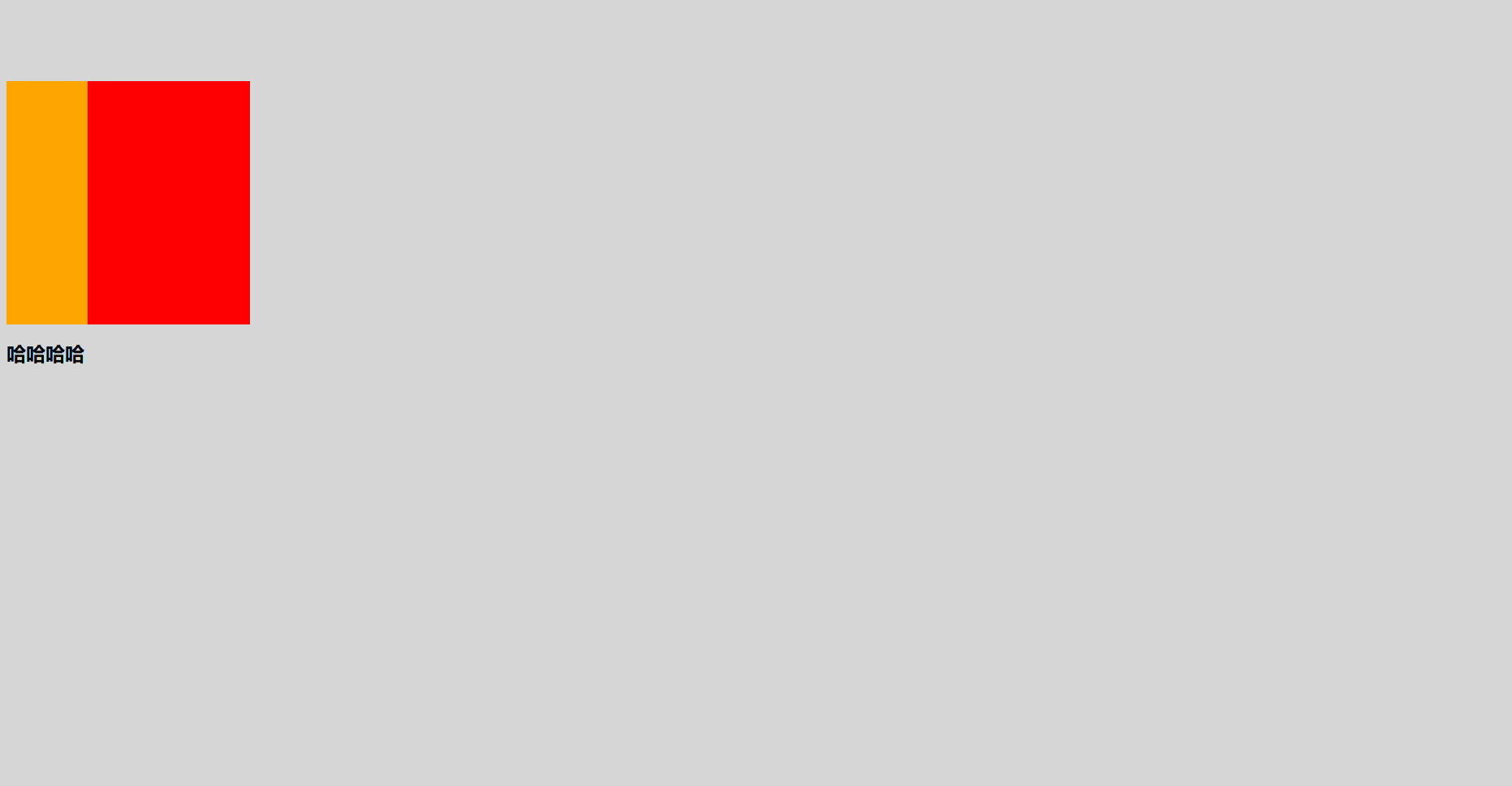
如果没有折叠,应该是块级元素与父元素组件有间隔,但实际上margin-top值传递给了父元素
margin-bottom传递
1 | .container{ |
- 如果块级元素的底部线和父元素的底部线重写,并且父元素的高度是auto,那么这个块级元素的margin-bottom值会传递给父元素
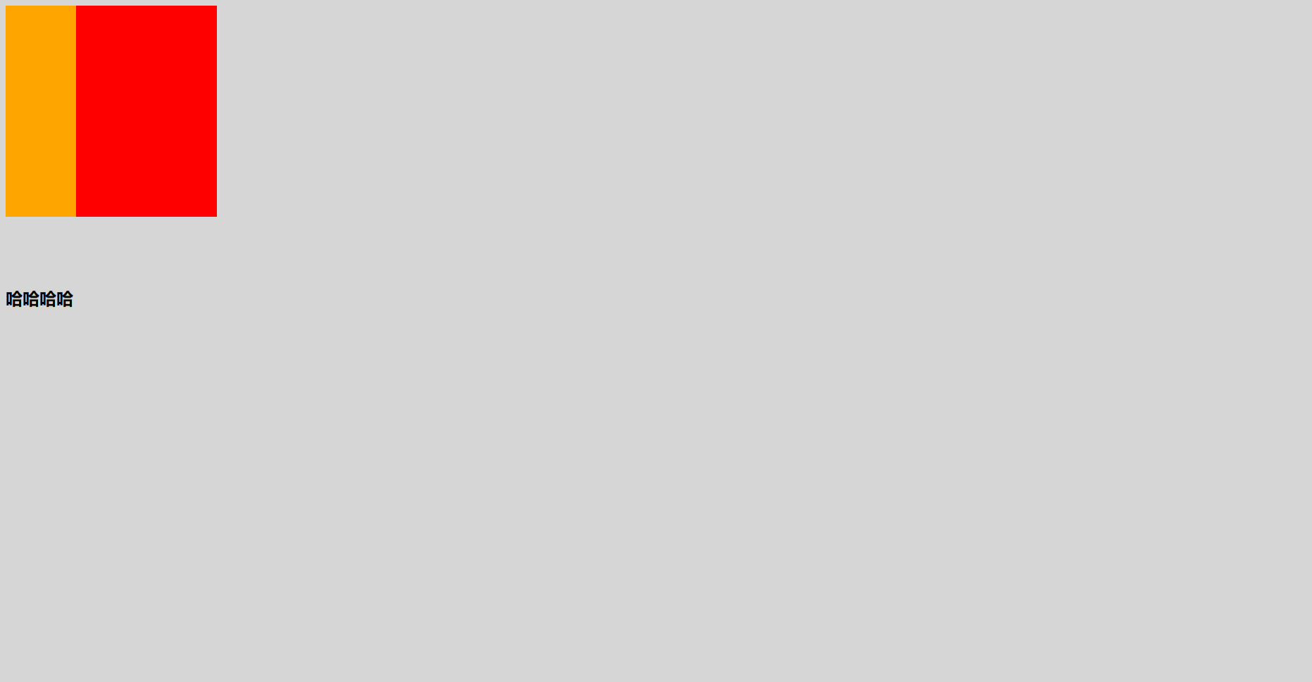
如果没有折叠,应该是块级元素与父元素组件有间隔,但实际上margin-bottom值传递给了父元素
防止margin传递
- 给父元素设置padding-top\padding-bottom (必须额外添加padding)
- 给父元素设置border (有时候boder影响样式,设置boder透明依然会占据空间)
- 触发BFC: 设置overflow为auto
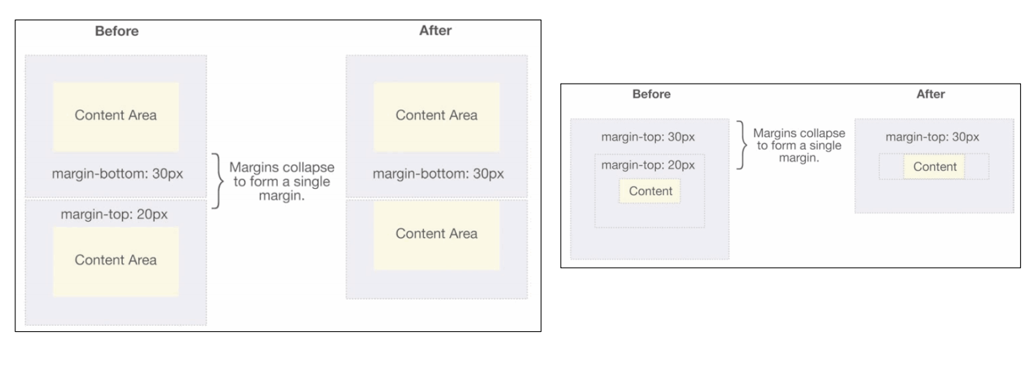
margin的上下折叠——兄弟父子都有
- 垂直方向上相邻的2个margin(margin-top、margin-bottom)有可能会合并为1个margin,这种现象叫做collapse(折叠)
- 水平方向上的margin(margin-left、margin-right)永远不会collapse
- 折叠后最终值的计算规则: 两个值进行比较,取较大的值
- 防止上下折叠:只设置其中一个元素的margin
元素水平居中方案
父元素一般为块级元素、inline-block:
- 行内级元素:text-align:center
- 块级元素:margin:0 auto
元素的宽度公式:
元素实际占用宽度 = border + padding + width
元素实际占用高度 = border + padding + height
普通块级元素
父元素宽度 = 子元素宽度+margin-left+margin-right
父元素高度 = 子元素高度+margin-top+margin-bottom
使用案例
- 父元素宽高知道、margin-left,margin-right设置为0,则子元素宽度auto为赋值为父元素宽度——高度不适用
1 | <style> |

父元素宽高知道,子元素宽度知道,margin-left,margin-right设置为auto会自动对半分,则可以水平居中——只针对block生效
少在高度上使用这个公式,因为浏览器对margin-top,margin-bottom的处理有些特殊
绝对定位元素(absolute/fixed)
定位参照对象的宽度 = left + right + margin-left + margin-right + 绝对定位元素的实际占用宽度
定位参照对象的高度 = top + bottom + margin-top + margin-bottom + 绝对定位元素的实际占用高度
使用案例
- 父元素宽高知道,子元素宽度知道,left 、right 、 margin-left 、 margin-right均设置为0,则子元素高度auto为赋值为父元素宽度——宽度同样使用
1 | <style> |
- 父元素宽高知道,子元素宽高知道,left、right设置为0,margin-left,margin-right设置为auto会自动对半分——高度同样适用
CSS中元素的定位
标准流:默认情况下,元素都是按照normal flow(标准流、常规流、正常流、文档流【document flow】)进行排布
- 从左到右、从上到下按顺序摆放好
- 默认情况下,互相之间不存在层叠现象
- 标准流可以用margin-padding进行位置的调整
- 设置一个元素的margin或者padding,通常会影响到标准流中其他元素的定位效果
- 不便于实现元素层叠的效果
position属性
默认值(static):
- 元素按照normal flow布局
- left 、right、top、bottom没有任何作用
相对定位(relative)
- 元素按照normal flow布局
- 可以通过left、right、top、bottom进行定位
- 定位参照对象是元素自己原来的位置
- left、right、top、bottom用来设置元素的具体位置,对元素的作用如下图所示
- 应用场景:在不影响其他元素位置的前提下,对当前元素位置进行微调
固定定位(fixed)
- 元素脱离normal flow(脱离标准流、脱标)
- 可以通过left、right、top、bottom进行定位
- 定位参照对象是视口(viewport)
- 当画布滚动时,固定不动
绝对定位(absolute):
- 元素脱离normal flow(脱离标准流、脱标)——脱标前的元素不变,脱标元素会放在之前的元素后面,但是后面的元素会当脱标元素不存在(不更改top等的值)
- 可以通过left、right、top、bottom进行定位
- 定位参照对象是最邻近的定位祖先元素
- 如果找不到这样的祖先元素,参照对象是视口
- 定位元素(positioned element)
- position值不为static的元素
- 也就是position值为relative、absolute、fixed的元素
position为absolute/fixed元素的特点(绝对定位元素)
可以随意设置宽高——position为relative的不能
宽高默认由内容决定
不再受标准流的约束
不再严格按照从上到下、从左到右排布
不再严格区分块级(block)、行内级(inline),行内块级(inline-block)的很多特性都会消失——同样position为relative的不能
不再给父元素汇报宽高数据——不会撑起父元素,如下面代码的div高度会为空
1 | <style> |
- 脱标元素内部默认还是按照标准流布局
粘性定位(sticky)
- 可以看做是相对定位和固定(绝对)定位的结合体
- 它允许被定位的元素表现得像相对定位一样,直到它滚动到某个阈值点
- 它允许被定位的元素表现得像相对定位一样,直到它滚动到某个阈值点
- sticky是相对于最近的滚动祖先包含滚动视口的(
浮动float
以前多列布局的常用方案
- 脱离标准流